Read Time – 4 minutes
We’ve all been there, spending hours crafting a dashboard, slide deck, or report packed with insights.
But when we share it, we’re met with blank stares, confusion, or a flood of follow-up questions.
The problem? We focus on what we find interesting instead of what our audience needs to know.
If you want your data to land, engage, and drive action, you need a better approach. And it starts with asking the right questions.
The Fix: Frame Your Data With the Right Questions
Your audience isn’t looking for random trends or interesting metrics. They’re looking for answers.
Instead of dumping data and expecting people to figure out what matters, frame your visuals around the top business questions your audience actually cares about.
Before you build a chart, dashboard, or report, ask:
- What are the top questions my audience needs answered?
- How can I structure my data to answer them instantly?
This works in slides, dashboards, and spreadsheets. Let’s look at how it transforms each format.
Example 1: Slide – Before & After
Before: A standard slide with a bar chart labeled “Revenue by Segment.”
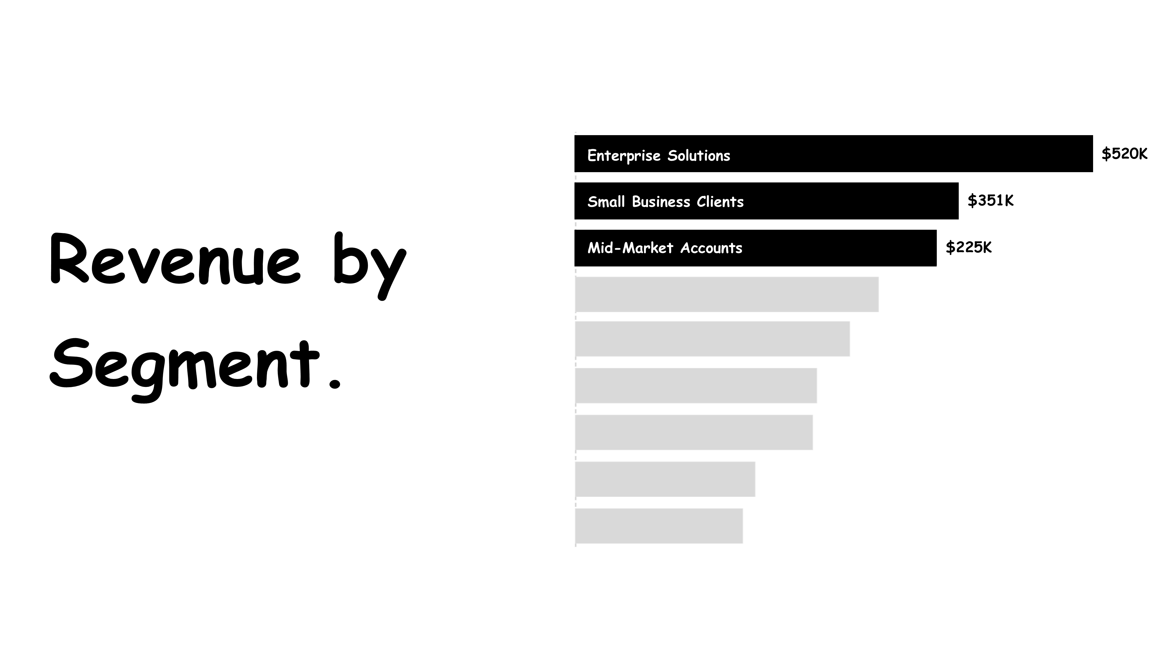
✘ The audience has to figure out what’s important.
✘ There’s no clear takeaway.
After: The slide title is reframed as a question:
What are the top-performing customer segments by revenue?
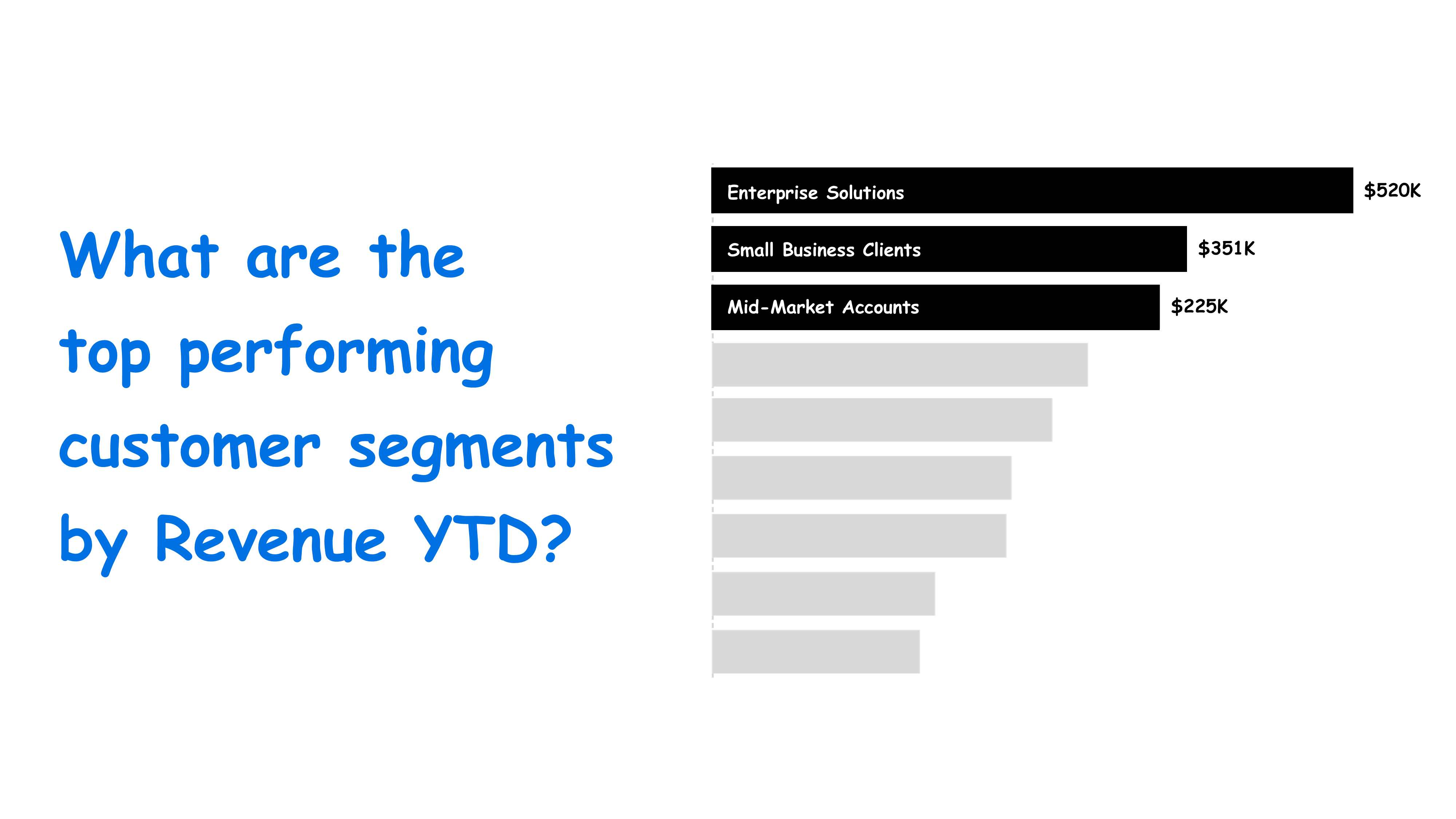
✔ The key insight is clear at a glance.
✔ The audience instantly knows what they’re looking at.
Takeaway: A simple question makes the data easier to process and remember.
Example 2: Dashboard – Before & After
Before: A dashboard crammed with multiple charts and metrics.
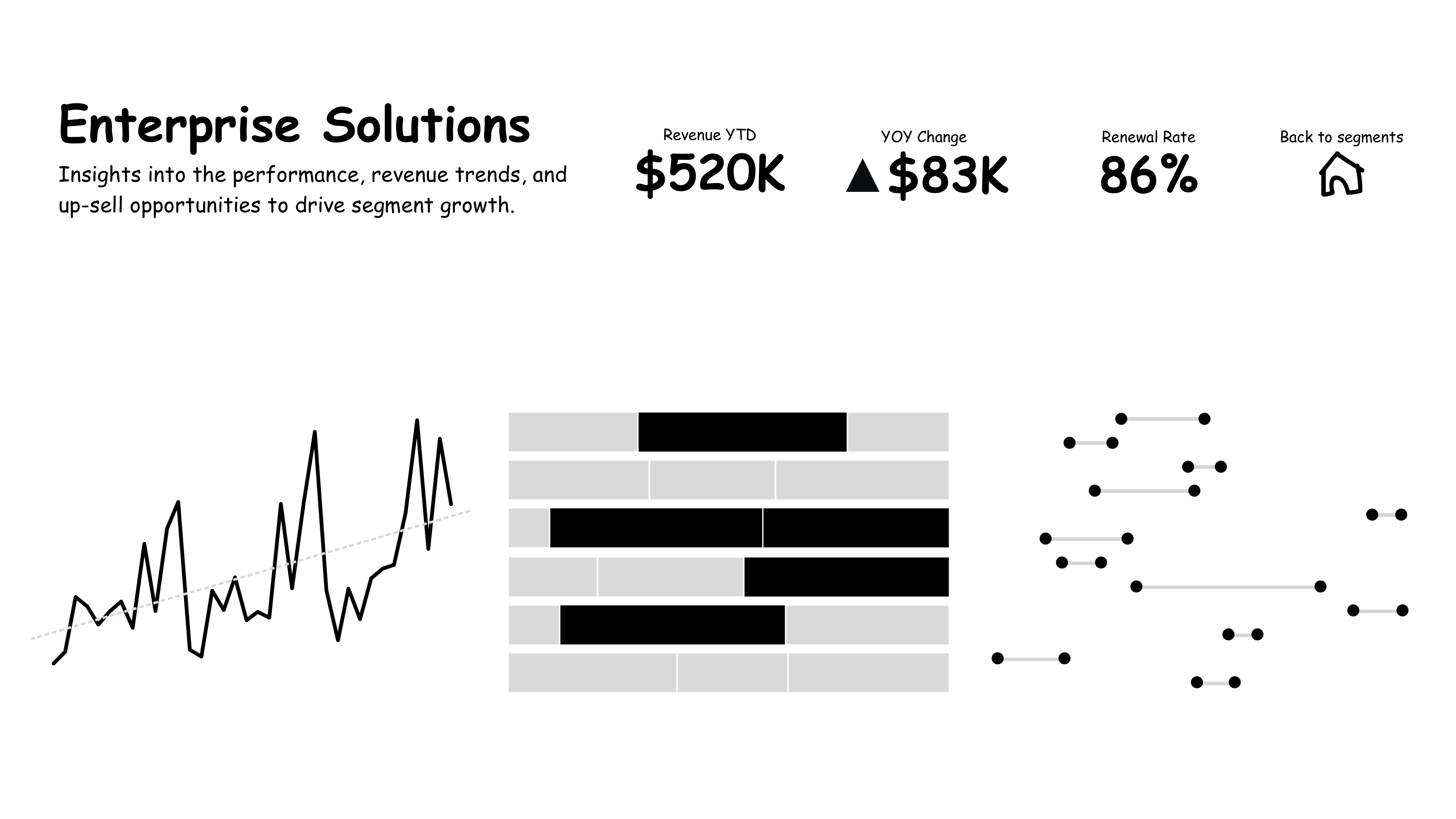
✘ Users don’t know where to start.
✘ Important insights are buried in the noise.
After: The dashboard is structured around key business questions:
- What are the key revenue trends over the last 12 months?
- Which products contribute most to revenue?
- How does upsell revenue compare to other segments?
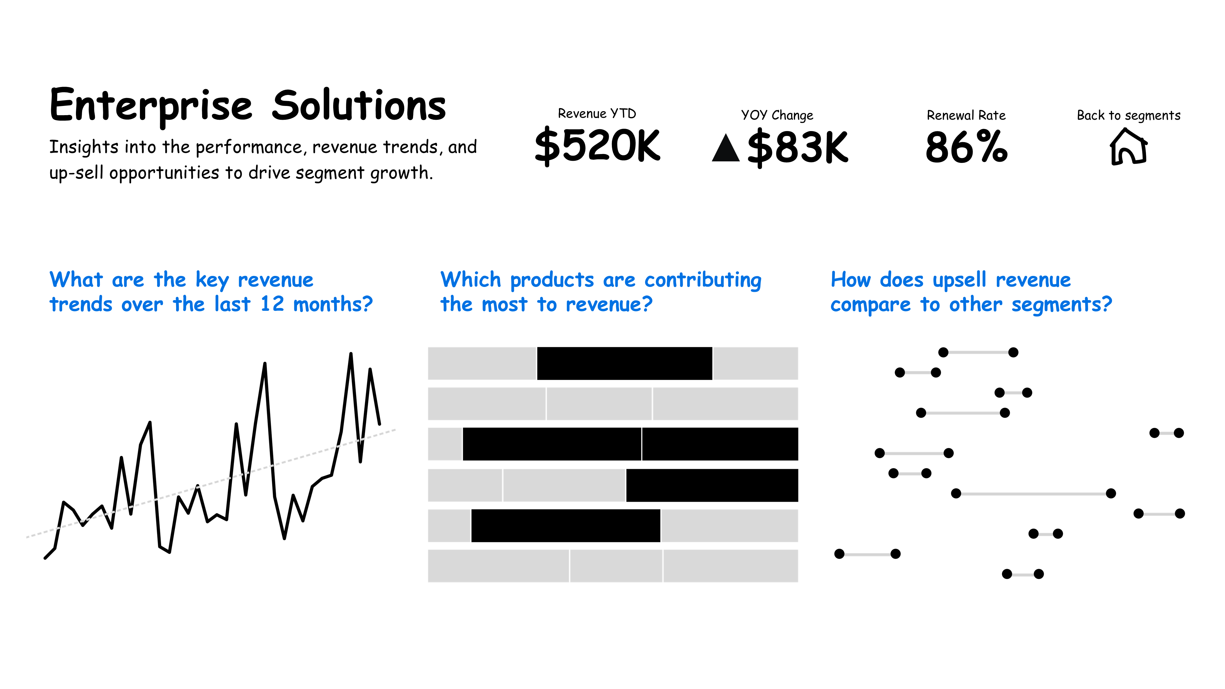
✔ The audience can quickly find answers without guessing.
✔ Decision-making is faster and more focused.
Takeaway: When you design around questions, your audience doesn’t have to hunt for meaning, it’s built in.
Example 3: Spreadsheet – Before & After
Before: A raw Excel file with rows and columns of data.
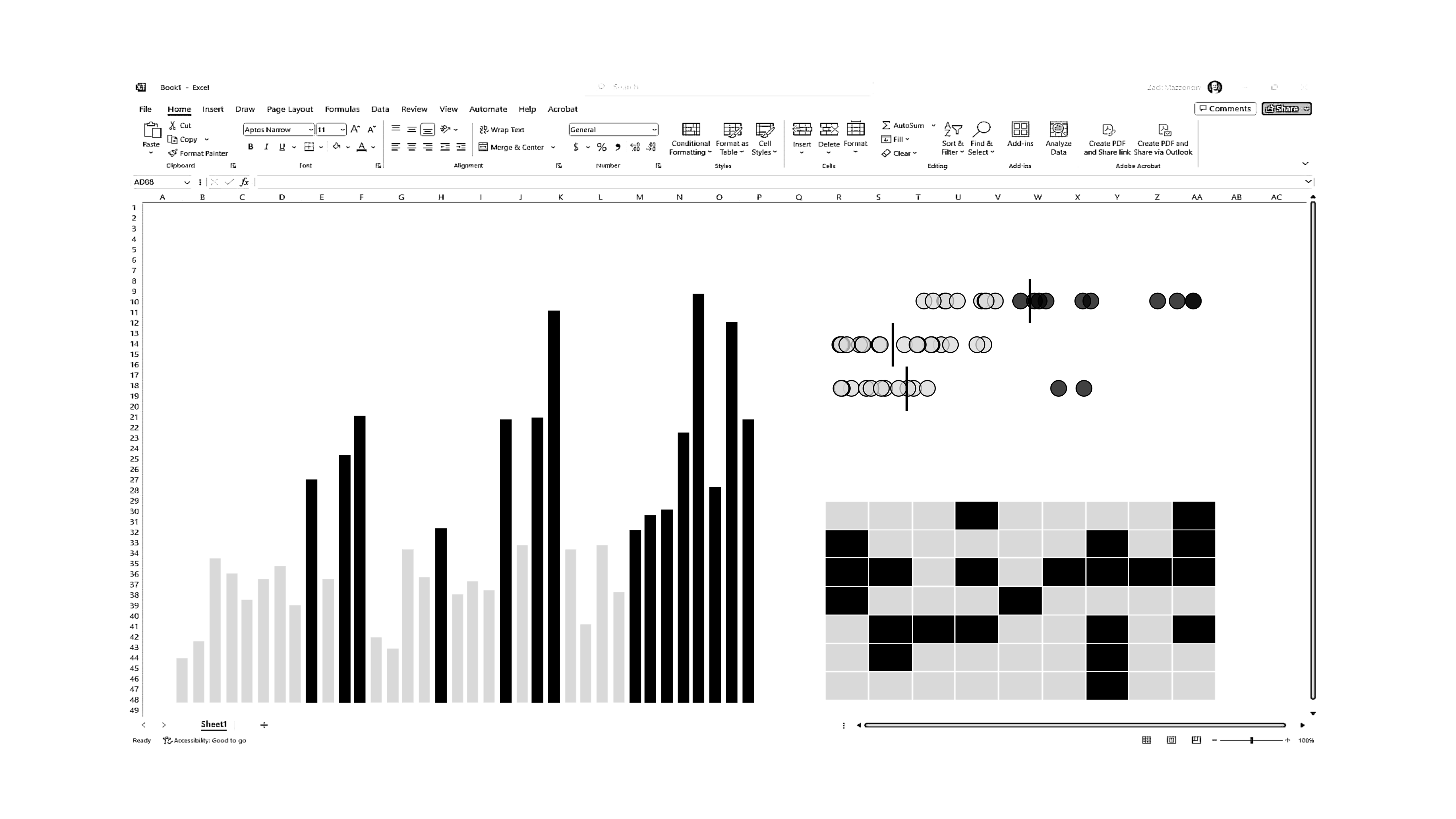 ✘ Requires too much effort to interpret.
✘ Leads to follow-up questions instead of action.
After: Key visuals are added, and column headers are turned into questions:
- What is usage by week?
- What is usage by region & area?
- When is engagement highest?
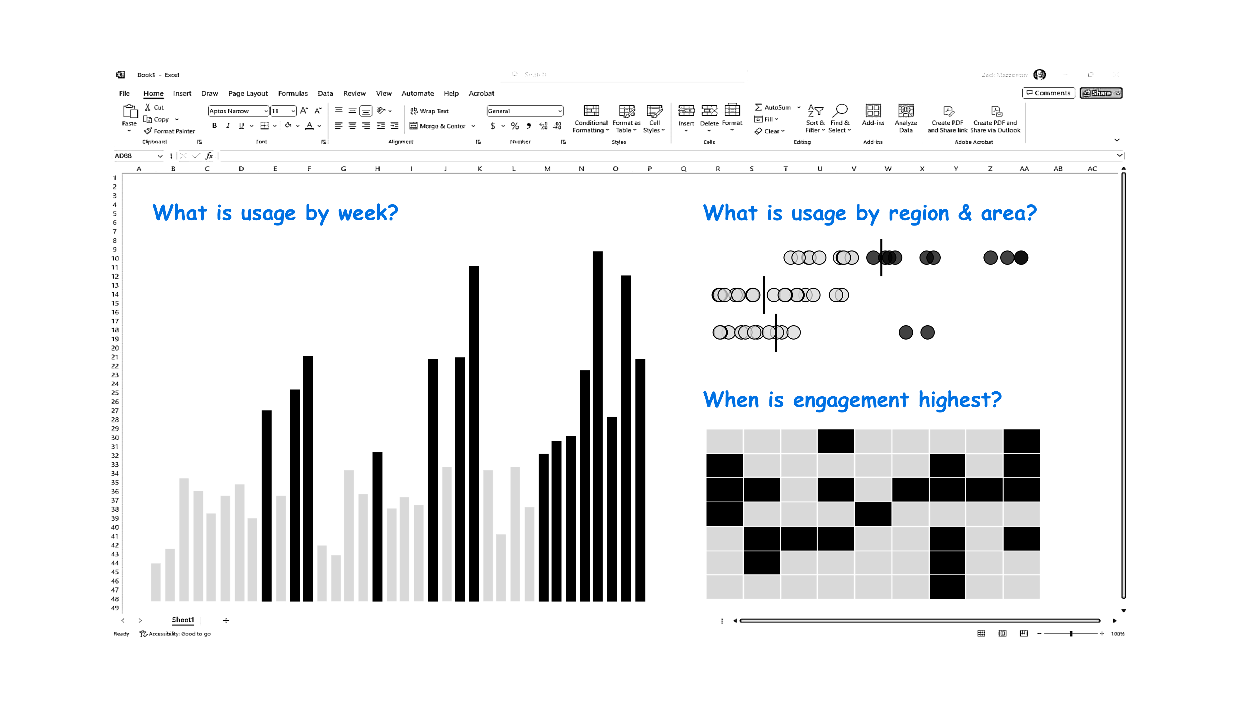
✔ Stakeholders instantly understand the trends.
✔ The spreadsheet becomes a self-explanatory resource instead of a puzzle.
Takeaway: Even spreadsheets become powerful decision-making tools when framed with the right questions.
Why This Works
- It keeps your audience engaged. People are naturally drawn to questions, they trigger curiosity and attention.
- It reduces cognitive overload. Instead of figuring out what’s important, your audience gets an instant shortcut.
- It makes insights stick. A well-framed question makes data easier to remember and act on.
Take Action: Make Your Data Impossible to Ignore
Next time you design a slide, dashboard, or report, don’t start with the data, start with the questions.
✔ Ask your audience: "What are the top three questions you need answered?"
✔ Structure your charts and visuals to answer those questions instantly.
✔ Make your titles, labels, and insights revolve around what matters most.
Your data is only as powerful as its ability to drive action. Give your audience a reason to care.
Make Your Charts Work for Your Audience
Confusing charts create confusion. Clear charts drive action. At Data Story Academy, we teach professionals how to design visuals that instantly answer the right business questions so your audience never has to guess.
- Create dashboards that get to the point.
- Design slides that engage, not overwhelm.
- Turn reports into decision-making tools.
Ready to transform your data storytelling?
Let’s make your data impossible to ignore. See you next Tuesday!