Read Time – 4 minutes
We’ve all seen them.
Dashboards overflowing with colorful charts. Reports packed with complex visuals. Slides that feel like a data dump.
The problem? Most charts don’t make insights clear—they make them harder to find.
If your audience has to decode your visual before they can understand it, you’ve already lost them.
Let’s fix that.
The Problem: Confusing Charts Kill Insights
A well-designed chart should make the takeaway obvious at a glance.
But too often, we see charts that:
✘ Use the wrong type of visualization
✘ Have too much clutter, making patterns harder to spot
✘ Lack emphasis, leaving the audience unsure what matters most
The fix? Use the 3-Step Chart Clarity Process.
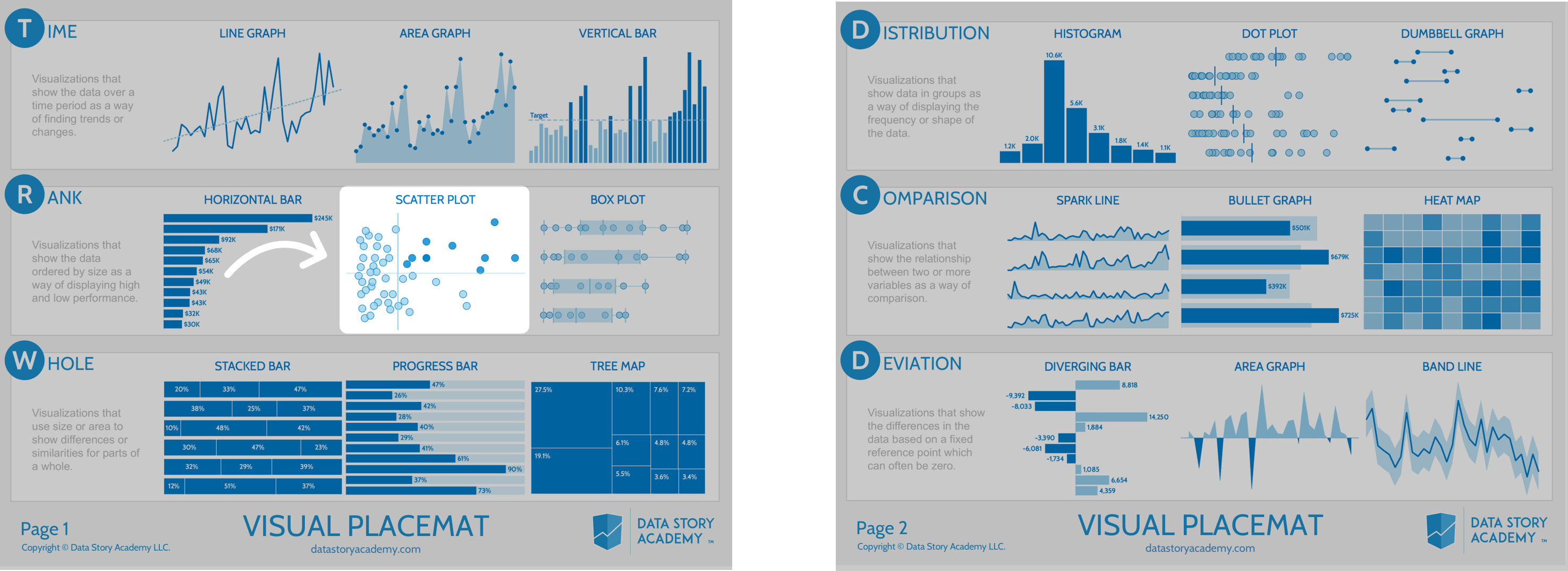
Step 1: Select the Best Chart for Quick Insight
The first mistake in data visualization? Choosing the wrong chart.
Your audience doesn’t have time to interpret complex visuals. Your job is to pick the right chart that instantly conveys the insight.
Use a Chart Selection Guide:
✔ Comparisons? → Use a bar chart (not a pie chart).
✔ Trends over time? → Use a line chart (not a stacked bar).
✔ Distributions? → Use a histogram (not a line chart).
✔ Correlations? → Use a scatterplot (not a table).
Pro Tip: Start with the simplest chart that communicates the insight.
More complexity ≠ more clarity.
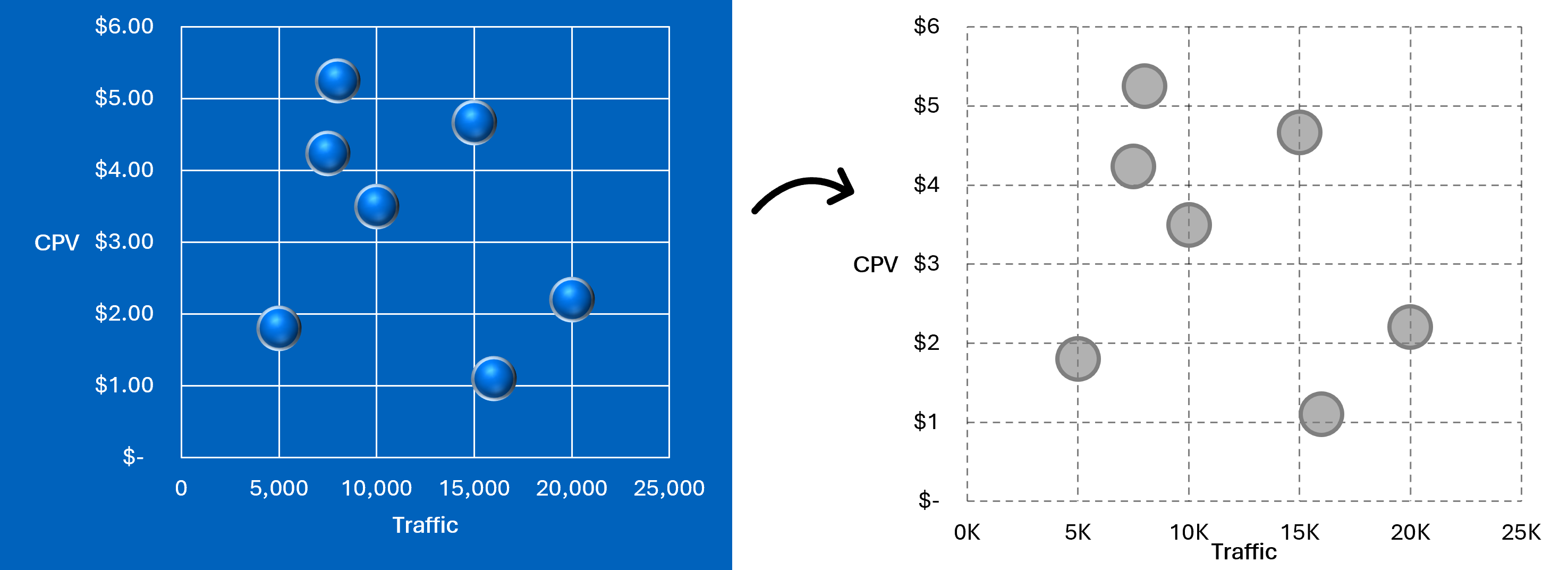
Step 2: Simplify—Remove the Noise
Once you’ve selected the right chart, strip away distractions that make it harder to read.
1 Delete unnecessary labels – Only keep what’s essential.
2 Reduce colors – Use one highlight color to focus attention.
3 Declutter axes & gridlines – Keep only what adds value.
Your goal? Make your chart as easy to read as a stop sign.
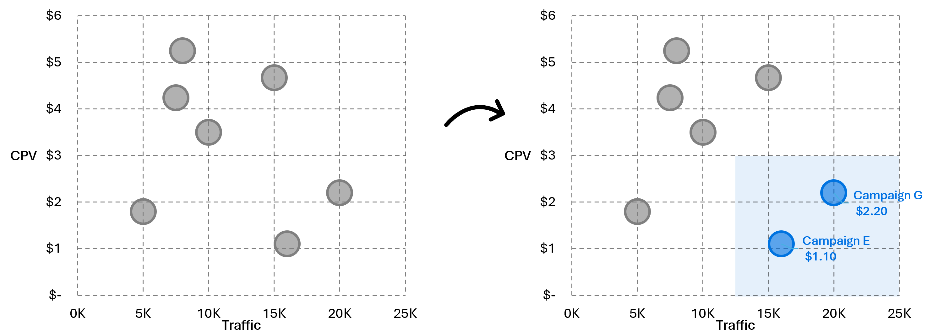
Step 3: Signal—Guide Attention to the Key Takeaway
Even a well-chosen, simplified chart can still leave people guessing what matters most.
Your job isn’t done until you highlight the key insight.
1 Use bold text or callouts to highlight key numbers.
2 Add a single accent color to direct focus.
3 Label the insight—don’t make them search for it.
The best charts don’t just display data—they communicate a message.
The Before & After: See the Difference
✘ Before: A cluttered chart that overwhelms instead of clarifies.
✔ After: A streamlined visual story where key insights jump off the page.
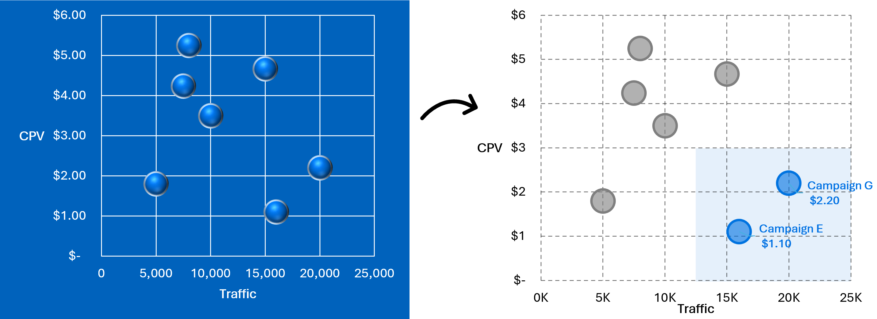
Why This Works
✔ Speeds up decision-making → No more guessing what the chart means.
✔ Increases engagement → Clear visuals keep people focused.
✔ Reduces follow-up questions → Stakeholders get what they need the first time.
Take Action: Fix Your Charts Today
Next time you create a chart, ask yourself:
1 Did I select the best chart for the insight?
2 Did I remove unnecessary clutter?
3 Did I highlight the key takeaway?
If not—fix it.
Your audience doesn’t need more data. They need clarity.
Master Chart Design at Data Story Academy
Confusing charts lead to missed insights. At Data Story Academy, we teach professionals how to create charts, dashboards, slides, and reports that get to the point—fast.
Ready to create insight understanding with your data?
Let’s turn your data into stories. See you next Tuesday!