If you’re presenting charts that get glazed-over looks, constant clarification questions, or zero follow-up… your charts aren’t working.
And it’s not because the data is wrong.
It’s because the way it’s being shown is failing your audience.
Here are 3 reasons your charts are falling flat and how to fix them fast.
1. You Picked the Wrong Chart
Treemaps, donuts, 3D bars... they might look cool, but they rarely clarify.
The problem? Most of them make it harder to see what matters.
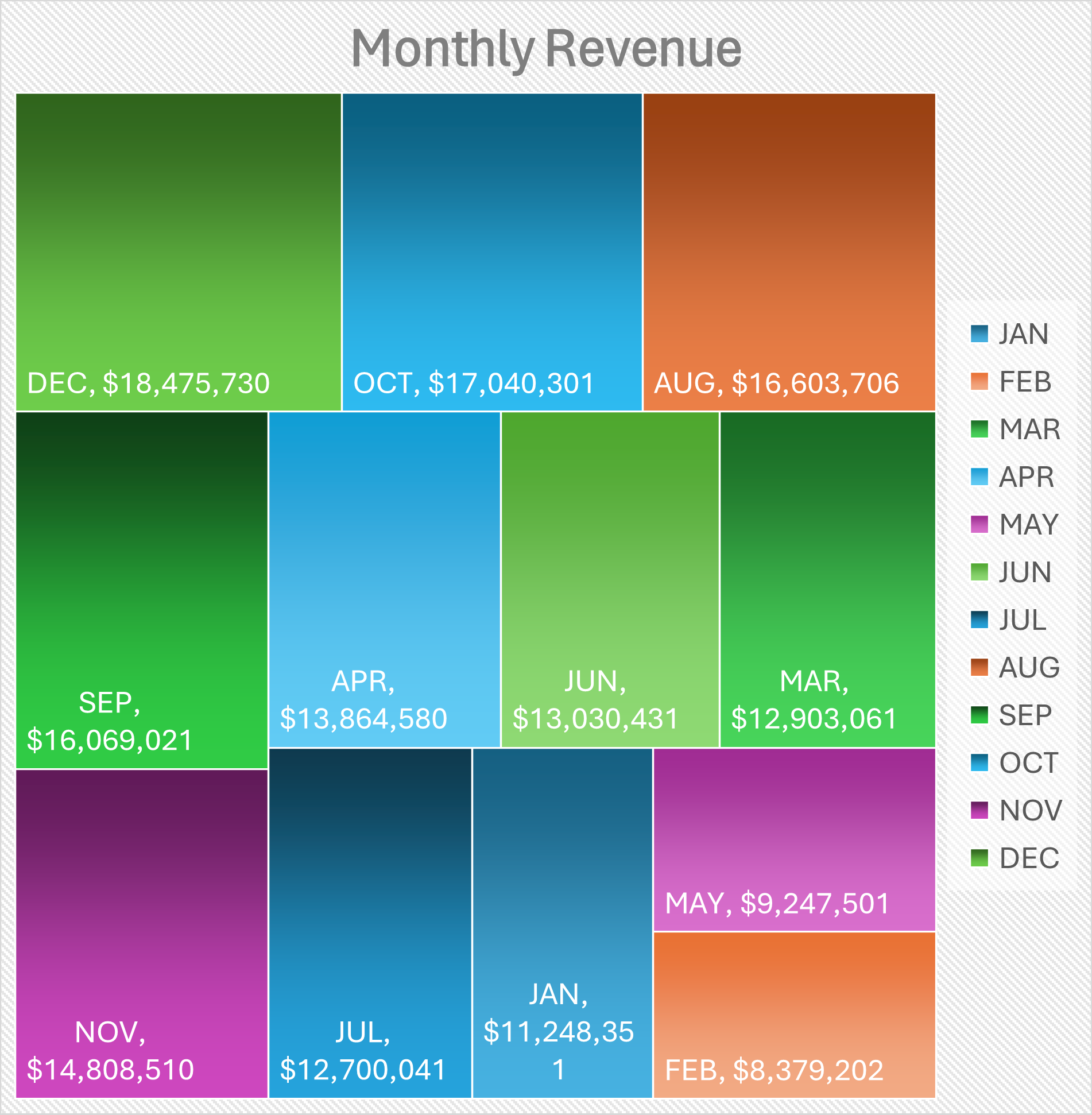
Before: A treemap crammed with monthly revenue data
✘ No clear trend
✘ Hard to compare
✘ Confusing color overload
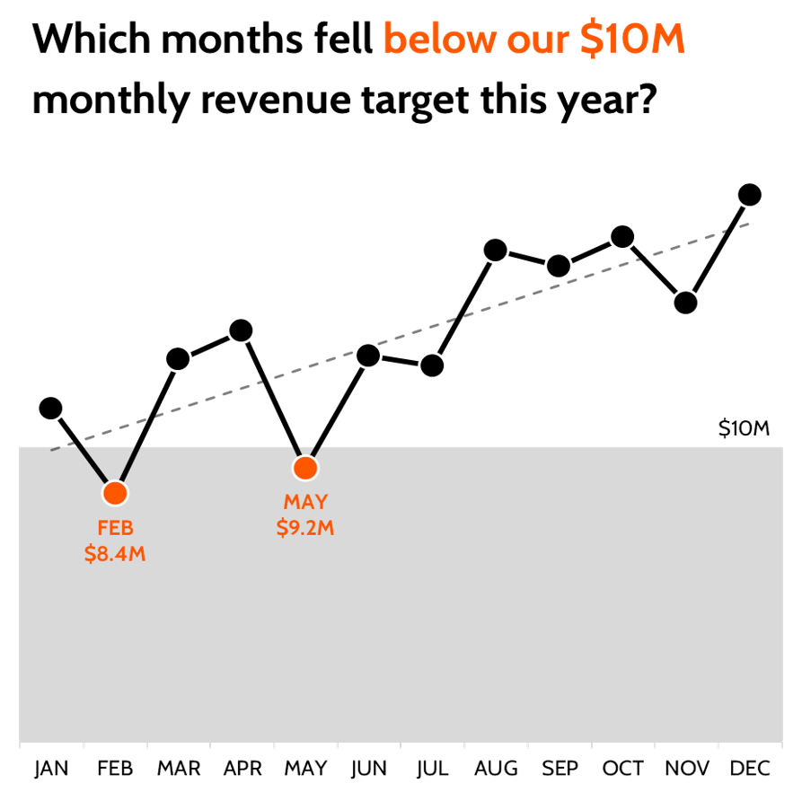
After: A clean line chart paired with a question:
✔ Clear insight
✔ Obvious takeaway
✔ Audience knows where to look
Fix it:
Use simple charts that match the story:
2. It’s Designed to Impress, Not Inform
Busy visuals feel impressive but slow your audience down.
Design clutter distracts from insight.
Here’s what poor design looks like:
✘ Loud colors
✘ Bad labels
✘ Unnecessary junk
Fix it:
-
Highlight the most important data
-
Remove anything that doesn’t serve your point
-
Make the layout feel effortless to read
Design is not decoration, it’s direction.
3. There’s No Clear Message
“Monthly Revenue” is not a headline. It’s a label.
When your charts don’t explain what matters, your audience has to figure it out on their own.
And when they’re not sure what to focus on, they tune out.
Fix it:
Turn your chart title into a question or insight.
“Which months fell below our $10M monthly revenue target this year?”
That single sentence changes how people engage with the chart.
Words give charts meaning. Use them wisely.
Why This Works
✔ Simplifies complex information
✔ Highlights what matters most
✔ Turns data into decisions
Take Action
Before your next presentation:
- Pick the chart that matches the message
- Strip out the noise and focus attention
- Pair every chart with a question or headline your audience cares about
Don’t just show data, guide decisions.
Because the best charts aren’t just seen, they’re understood.